 Can people get where they need to go on your website in just a few clicks? If not, it could cause them to leave instead of converting to a sale.
Your website’s navigation is a vital part of any well-optimized MSP website. People must be able easily find what they need and get back to where they were without getting lost.
The menu on your website significantly impacts traffic, time on site, and conversions. You can make that impact a positive one by following best practices to improve a visitor’s journey through your site.
Improve the Journey Through Your Website With These Tips
Your website navigation menu shouldn’t just be an afterthought when designing your IT business site. The map that takes people through your site is one of the most important site elements to a visitor, in fact for a majority it is THE most important.
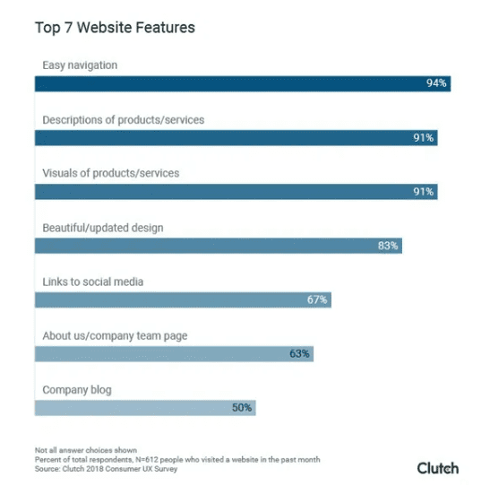
According to Small Business Trends, in a survey of US consumers age 18 to 65+ by Clutch, easy website navigation was noted as the most important website feature by 94% of the participants.
You’ll often read about the importance of good UX design, which means designing to improve user experience. Navigation is a big part of this. People can easily get frustrated if they can’t find what they’re looking for on a website, especially on mobile.
Poor navigation can cost you sales and can also negatively impact SEO ranking signals (more bounces, less time on site).
When is the last time you reviewed your website navigation from a visitor’s point of view? It may be time to check it out and, where needed, apply the following best practices for great site navigation and user experience.
Use Descriptive Labels
Many IT business owners use menu labels like “solutions” and “services” side by side. Which one is a visitor supposed to go to first if they need help optimizing their wireless network?
Forbes notes that in a study of how users perceive generic website navigation labels, participants were asked to find a specific item under five generic navigation options: Features, Platform, Products, Services, Solutions.
What was found that there was no consensus of where that information would be, with users choosing different navigation options, unsure of how to locate the item they were looking for.
You want to be as descriptive in your navigation labels as possible. For example, instead of just a generic “Services” try splitting your services up into different nav labels, like this:
- Managed Services
- Cybersecurity
- Network Services
- Cloud & Software
Make Sure Your Navigation is Easy on Mobile
Website owners need to think “mobile first” these days, especially those that own local businesses. Approximately 60% of all local searches for products and services are now done on a mobile device.
Pull up your website on your own smartphone and see how easy it is to get around. Just because you’re using a responsive WordPress template, doesn’t necessarily mean navigation is set up correctly for mobile.
61% of mobile users will leave and not come back to a website if they find it hard to navigate. And 40% of them will visit a competitor’s site instead.
Below, is an example of both good and poor site navigation on a smartphone view of a site.
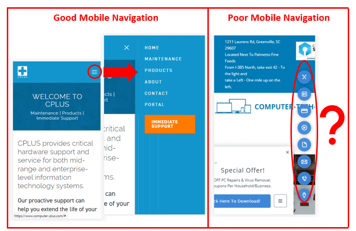
The “good” example uses the standard menu pop out of the three lines (also called the “hamburger”) and gives the user a clear map for how to get around the site.
In the “poor” example, you can see how not only the site itself is confusing (you can’t even see the company name!), but also those navigation icons at right aren’t going to tell someone where they’re going.
Don’t Use Dropdown Menus If You Can Avoid Them
Dropdown menus are a popular way to add a lot of page links without taking up too much horizontal space at the top of a website. But they are problematic when it comes to site navigation.
Reasons to stay away from dropdown menus or use them sparingly:
- Dropdown menus can easily disappear when someone is trying to choose a submenu option. (Frustrating!)
- Submenu options in a dropdown are more difficult to display properly on a mobile device.
- Dropdowns encourage visitors to skip top level pages.
- Using dropdowns often leads a site owner to “fill in the options,” and add too many links, leaving a user confused about where to go.
If you absolutely have to use dropdowns, the Mega Menu, has been shown to be one of the least confusing methods.
Don’t Offer Too Many Choices
There is a fine balance a website owner needs to strike between having a robust site and giving a visitor so many navigation options that they become confused.
Large sites like Amazon use a well-honed search feature as their main method of user navigation, but this doesn’t work as well if you’re not a mega retailer.
It’s important to keep options to a minimum. Many developers recommend somewhere in the 5 to 7 menu option range. There is also a famous Harvard University research paper from 1956 on cognitive memory that is still very relevant today. It discusses the “Magic Number Seven” as a sweet spot for grouping various chunks of information to keep an audience from being confused.
When you offer more options, each menu option loses some of its importance. So, keep in mind the most important areas of your website visitors need to get to from your home page, and as needed, you can have additional sub-topic menus on various interior pages (like cybersecurity or networking).
Add Your Contact Page & Put It in the Right Spot
When I’m navigating a website and don’t see the Contact Us link in the top menu, I immediately knock the company down a point in my mind. Your contact page is arguably the most important page when it comes to generating leads and sales.
44% of people that can’t easily find a way to contact an IT business will leave the site.
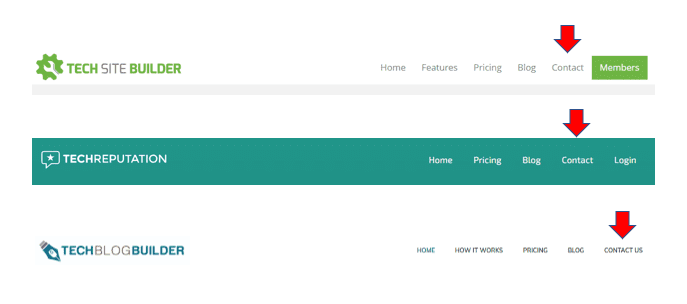
Most people will expect to see the Home link at the far left of a menu and the Contact link at the far right. An exception would be if you have a Members or Login area, this can be put to the right of the Contact link to make it easier for people to find.
Here’s how we do it on a few of our Tech Marketing Engine websites. Note that we keep our link options to a minimum – staying within that 5-7 sweet spot. 😉
Examples of Where To Put a Contact Link in Your Navigation
Use Bottom Navigation Too
Many website visitors will go straight to the bottom of a website if they don’t see what they need in the top navigation.
Using bottom navigation (also called the footer menu) allows you to add more links and make link text smaller. And more importantly, you give users a better overall experience on your website by making it easier for them to find what they need.
Here are some reasons I’m a big bottom navigation user:
- It will typically have more options than the top navigation
- It will usually be easier to read (no dropdowns, no images in the way, etc.)
- If I can’t find an About Us in the top navigation, I know that if they have one, it’s going to be in the bottom nav menu.
Using a top and bottom navigation strategy allows you to please all types of users, those that like simple and easy to find (top), those that like simple and easy to find, with more options (bottom).
Don’t Use Buttons in Your Main Navigation Menu
Text links are the best to use in your navigation menu because they are easy to read and can also be picked up by search engines.
If you try to use buttons, it can be more difficult for a mobile user to see menu options and you can also hurt the impact of your Call-to-Action (CTA).
One of the best practices for a CTA is to put it in an easy to identify button that people can feel good about pressing to take some sort of action. If you have your entire navigation in buttons as well, your CTAs are much easier to overlook and won’t stand out as well.
Make It Easy for People to Jump Between Pages
When you’re navigating a website, it’s frustrating when you can’t easily jump between pages and have to go back out to a main page to get where you need to go. Another problem many sites have is when people get lost and can’t find their way back to where they were.
Make it as easy as possible for people to jump between pages and know where they are on your website. Think of your navigation menu as a personal “GPS” to make your site visitors’ journey better.
Some ways to make it easy to jump between pages:
- Keep your navigation menu (top and bottom) consistent throughout all your pages.
- Consider using breadcrumbs in your navigation.
- Give people a link in your bottom footer menu to a site map page.
- Link your logo (which is usually at the top of all site pages) to your Home page.
Make Your Site an Enjoyable Journey for Visitors
Optimizing your site navigation can have multiple benefits, including better search rankings, more leads, and more sales. It’s definitely worth the time to visit your site yourself on desktop and mobile to see where your menu can be improved.
What best practices do you use in your website navigation? Share your tips in the comments!
Speak Your Mind