
Perhaps the most important page on your website when it comes to getting leads is your “Contact Us” page. Its entire purpose is to get people to reach out to your tech business.
But too often, that page is overlooked. People just slap up a webform and maybe their phone number and think that’s enough.
How many more leads might you receive if you optimized your contact page? We’ve got several tips for creating an effective MSP website contact page that will invite people to reach out to you.
What Makes an Effective Contact Page for an MSP Site?
Most people think a contact page is a “no brainer,” but if you don’t include it as part of your overall marketing strategy, you could be missing leads.
What are some of the reasons leads won’t take action on your contact page?
- Contact form is too long
- There is not enough information there (i.e. no address)
- No compelling reason given to contact you
- It’s boring or doesn’t look inviting
- Page takes too long to load
Let’s get into what you should and shouldn’t do when it comes to creating an engaging “contact us” page for your website.
Make Sure You Include Your Contact Details
How frustrated do you get when you’re trying to contact a company, only to find a form and nothing else on their contact page? Leaving off your phone number and address on a contact page can cause people to leave your site to look elsewhere.
Even if you have your contact details in the header or footer of your site, still put them on your contact page. Website visitors expect to see them there.
44% of website visitors will leave a site if there is no phone number or contact details.
At the very least you should include your phone number and email address on your contact page. The address is also important if you have a shop location. Not all technology businesses have a walk-in shop and may not want include their address. In that case, at least include your city and state.
SEO Tip: Make sure that any local citations out there (like Google My Business) match the email/phone/address that you have on your contact page. (Google checks this!)
Don’t Overload the Page (Keep it Mobile Friendly)
You want a fast loading contact page, so people don’t leave your site frustrated instead of contacting you. It also needs to be mobile friendly. 61% of people that find a local service or product from a mobile search will contact the business.
People don’t want to wade through a bunch of text to get to the contact form or find out where you’re located. Keep your contact page’s main purpose in mind when creating it.
You have an “About Us” page where you can tell them more about your company and include other details, they don’t need to overload your “Contact Us” page.
Add an Interesting Image or Background
A nicely placed image that matches your tech business branding and color scheme helps make a contact page more inviting. Adding an image to a page can also help drive conversions.
Even though your contact page isn’t technically a sales page, it’s still part of your conversion process, and you don’t want to lose anyone at that important step, so it should look nice and blend well with the rest of your website.
But, don’t just put the first photo of a person in a headset you see on your contact page. This type of generic “contact” image has been so overdone.
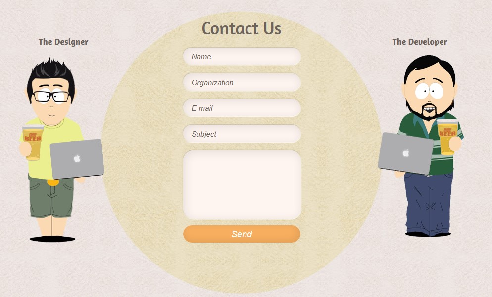
Illustrations can be just as inviting as photos. Like this cool example below from Melonfree.
Tell People Why They Should Contact You
Include a sentence or two about why people should contact you. This is a short version of a value proposition.
Here are a few examples:
- “Reach out to us and stop struggling with that computer issue.”
- “Want to improve your office productivity and reduce the risk of data loss? Contact us for a free consultation.”
- “Our technology experts are standing by and ready to tackle your IT challenge.”
Try to stay away from something boring and generic, like “Fill out the form below and we’ll get back to you.” Instead, inject your brand personality and make your statement memorable.
Keep Your Contact Form Short
There is a balance between wanting to gather as much information as you can and making your contact form too much work to fill out. If you have too many fields and require too much information, then people just won’t bother.
According to WPForms, you can see that the fewer fields you have, the better the form conversion rate:
- 3 form fields: 25% conversion rate
- 3-5 form fields: 20% conversion rate
- 6+ form fields: 15% conversion rate
Just gather the information you absolutely need, and be careful about how many fields you designate as a required field. Typically, you’ll want the following:
- Email (required field)
- Name
- A field for their question/request
If you really need it, you can add:
- Phone number
- Company name (if you do B2B)
Use a Great Call to Action on Your Button
Don’t miss a chance to put a great call to action on your “Contact Us” form. This is another way you can encourage people to reach out to you for help with an IT need.
You can find several tips for writing a great call to action here.
Instead of just “submit,” try something like:
- “Get IT Help Now”
- “Request Your Tech Consultation”
- “Get a Custom Quote in 24 Hours”
- “Learn What Great IT Support Looks Like”
Sprinkle in a Little Social Proof
One thing that can encourage someone that is on the fence about contacting you for a quote is some social proof on your contact page (aka: reviews). You have to be careful about adding reviews to a contact page though, because you could easily clutter the page and distract from the main objective.
That’s why I said to “sprinkle in a little.” What does a little look like?
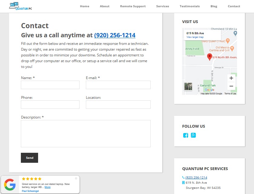
Our Tech Site Builder contact pages for our clients provide most of the recommendations in this article (i.e. short form, contact information, google map, social media, no clutter, and social proof).
Here is a contact form from one of our customers, Quantum PC Services, that shows how to add reviews on the contact page while still keeping the page clean and effective. (Lower left of image)
Tell People When They’ll Hear Back
Since many people do local searches from a smartphone, making it easy for them to get a quick call back, without them having to call you can increase your sales.
Adding a button to a contact page that asks “Do you want us to call you in 25 seconds?” can increase contact conversions as much as 120%, according to LiveCall.
Whether or not you want to sign up for that type of service, you can get more people to contact you if they know when they’ll hear back.
Put a note on your contact page that says something like, “We’ll get back to you within 1 hour during business hours” or “During non-business hours, we’ll respond within 24 hours.”
90% of consumers say an “immediate” response is important when they have a question, and 60% define “immediate” as 10 minutes or less.
Just use whatever is reasonable for your business because you want to meet or exceed the expectations you set with your response time promise.
Include a Google Map
If you rely on foot traffic for a lot of your sales, then including a Google map on your contact page can help people find you faster.
Just be careful of the placement. You don’t want the map to push everything else down on the page or be so big that it increases page load time. Here’s an excellent example of map placement by Digital Crisis.
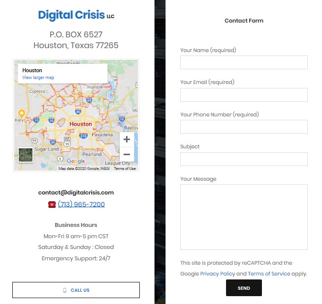
While COVID-19 social distancing has put a damper on in-store visits, if you offer curbside service for device repairs, be sure to mention that above the map!
Add Your Hours of Operation
When someone has a hard drive crash at 7AM and they go looking for help online, they’re going to want to know when you open.
The contact form example above, also includes a nice placement of operating hours and lets potential customers know they offer emergency service. This is something that can make the difference between getting a new sale or having someone go to your competitor because they have their hours listed.
Don’t Make the Phone Number a Required Field
Phone numbers are something that some people just don’t want to give out. They’re afraid of getting hounded by sales calls.
Adding a phone number to your contact form can cause page abandonment. But if you really want their phone number, then don’t make the field required.
If you make the phone number field optional, it’s been shown to decrease form abandonment from 39% to just 4%.
Add Your Social Media Links
These days, many people contact companies over social media. They’ll also often look to the contact page to find ALL the places they can keep in touch with your company, including your social media accounts.
Be careful about putting a full social feed on a contact page, it can be distracting and add to page load time. It’s best to include your social icons with links to your pages.
Place Your Contact Page Link in the Right Place
You don’t want visitors to have to go searching for your contact page, so don’t bury the link in a menu drop down.
There are two main places that people will look for your “Contact Us” page:
- Over to the far right of the navigation menu
- At the bottom on the page in the footer
Put it in both places. You want to make it as easy as possible for people to contact you.
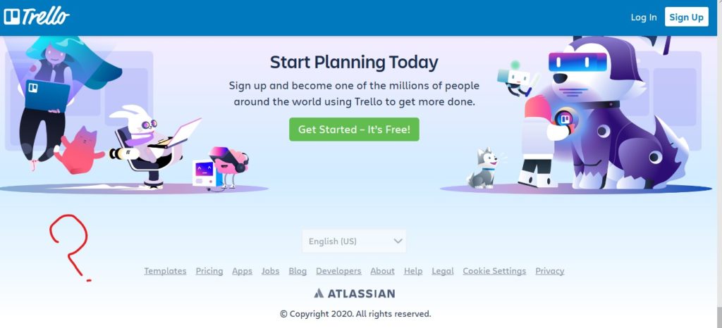
Here’s an example of how NOT to do it from Trello. Where is the “Contact Us” page? It’s not in the top navigation or the footer.
Fitbit on the other hand not only put their contact us link where people expect it, they highlight it in a different color to make it even easier to find (and more inviting).

Get Some Inspiration
There is no reason why a contact page has to be boring. It can be colorful, match your brand, and not too cluttered all at the same time.
Here are a few resources with several great examples for inspiration:
Take Pride in Your Contact Us Page
Every page on your tech business website is part of your lead generation process, and the contact page is one of the most important. Make sure you give it the love and attention it deserves!
What are some of the most memorable contact forms you’ve seen? Share in the comments!
Speak Your Mind