Cron test
New Features in Q3 2018: Coming Soon Page, Sticky Header, and more!
We’ve added a few new features in the 3rd quarter of 2018 that I wanted to catch you up on so you can continue to take full advantage of the Tech Site Builder platform as a customer (or see what we’ve been working on if you’re not a customer).
Coming Soon Page
We’ve had this request a few times so we decided to implement it as a feature. If you’re still working on your website, or making major changes to it, but you know that people will be visiting it, now you can show a “Coming Soon” page to your visitors.
The cool thing is, you as the admin of the site, will still be able to work on the site….only you visitors will see the coming soon page.
This new feature is available in the Site Settings screen of your dashboard.
Check out the video to see it in action:
Sticky Header
Add a little glue to to the top of your website withe the “sticky header” functionality. When enabled, your logo and navigation menu will stick to the top of the browser window as your visitor scrolls down. This makes it easy for your users to jump to another page (hopefully the “contact us” page!) no matter where they are on your site.
See how it works below:
Other Updates
We’ve been busy making other small updates and tweaks such as:
- There a new option to add open text in your header area. This is great if you’d like to add custom information like extra phone numbers or announcements.
- Full icon library (over 100!) available for services pages.
- Added “visited link” option to style settings so you can specify a different color for links that have been previously clicked.
- Turn commenting on and off globally via site settings screen.
- And much more! For a full list of changes to the platform, visit the Changelog.
What do you think of the latest updated? Let us know in the comments below.
Here’s to your success!
– The Tech Site Builder Team
Introducing the Visual Customizer
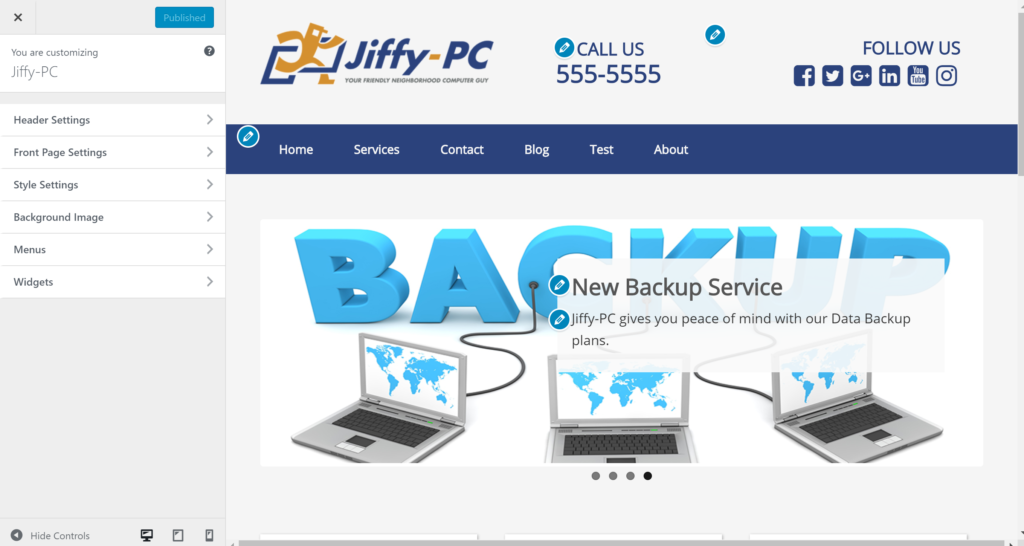
One of our primary goals here at Tech Site Builder is to make the experience of building a website as easy and hassle-free as possible. To that end, we’re happy to announce a new feature that should help speed-up and streamline the website build process.
A big frustration for many people when making changes to a website is that you don’t know what the end product is going to look like until you save your changes and view your website. By that time, your changes are already “live” and view-able to the public. This is not ideal.
We solved part of that problem with the implementation of the page builder last year. That allows you to edit the content of each page using a drag-and-drop editor that represents exactly what the finished page will look like.
But in order to update the other visual parts of your website, like the headers, colors, fonts, front page, widgets, menu, etc., you still needed to head to the good ol’ admin dashboard.
That changes today…
Introducing the Visual Customizer
With the Visual Customizer you can now make your overall site changes and see them applied in real time. We’ve migrated the Header, Home Page, and Style settings exclusively into the customizer.
Plus you can also make changes to your Navigation Menus and Widgets from the customizer as well (though you can still manage those two features from the dashboard like always).
Finally, there’s a new Background Image feature that you can use to set a texture, pattern, or photo background for your entire site.
Watch this walk-through to see how the new Visual Customizer works.
Some notable NEW features available in the customizer include:
Hundreds of Font Choices
In the customizer, head to the Styles menu and then the Basic sub-menu and you’ll see the drop-down menu for font selection has expanded to hundreds of choices!
Not sure what to choose? Head over to https://fonts.google.com/ and find something you like…chances are it will be available.
Preview Your Website in Mobile View
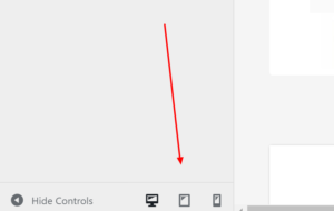 While in the customizer you may overlook the three little icons at the bottom of the screen. These represent desktop, tablet, and mobile phone screen sizes and allow you to switch between a simulation of what your website will look like on screens of those sizes.
Now you can make sure a change you made will look good on a mobile phone BEFORE you publish the change!
Share a draft of the changes you made before you make them live
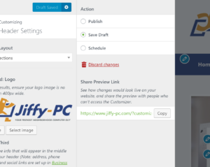 The little gear icon next to the Publish button in the customizer exposes a screen where you can save a draft of your current changes. Once you save your draft you’re then given a unique URL you can use to share your draft changes with others. The beautiful part is that your actual website will not change…so are free to make crazy changes and share them without worrying about your live website being affected.
On this same screen you can also schedule your changes to publish in the future. This all functions similarly to a blog post or page in the editor screen.
Take ‘er for a Spin!
Even if it’s been a while since you’ve updated your website…jump in and try out the new customizer. You just may find yourself with a renewed motivation to add that extra polish on to your well-worn website.
Introducing Our Front End Drag-and-Drop Page Builder
At Tech Site Builder our goal is to give you all the tools you need to build an effective website. Today we're introducing a new feature that will help you make building your website even easier!
With the new front-end drag-and-drop page builder you can now edit your pages in a very visual way with more control over how it looks.
With the page builder you can:
- Position images and text with precision
- Build column-based layouts in minutes
- Save and reuse rows & modules
- Add custom CSS for ultimate design control
- Insert code so you can integrate in 3rd party scripts (finally!)
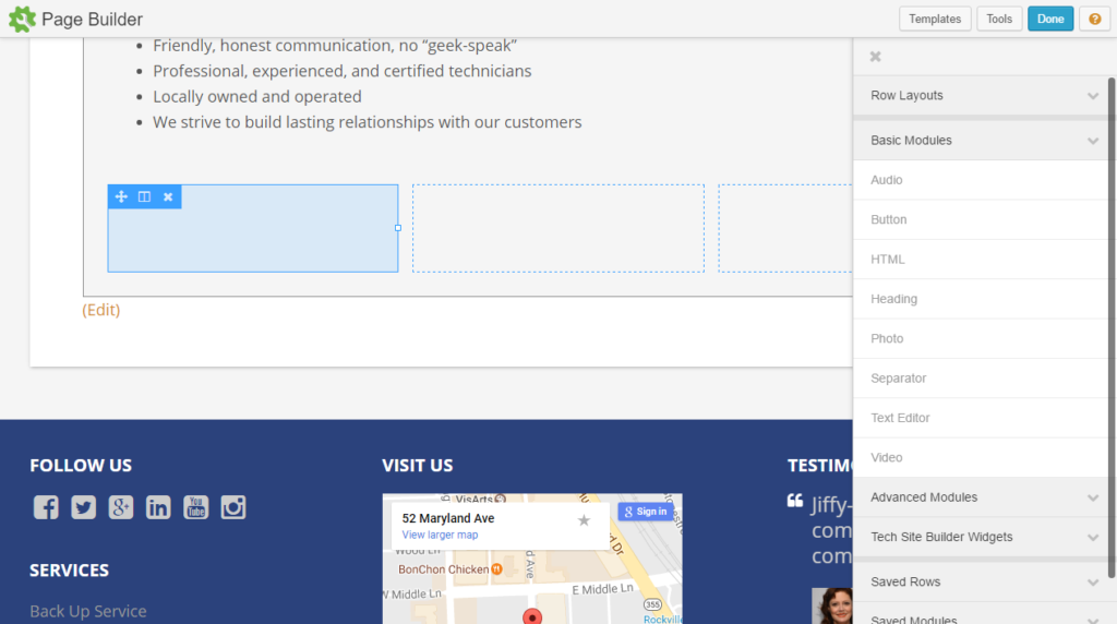 Now creating comuns on your page is a breeze!
Advanced Modules
Not only does the page builder make it easy to arrange the exact layout you want, but it also comes with a ton of advanced content modules. Here's a list of all the modules you get access to:
- Accordion - Creates an interactive accordion. Useful for an FAQ or Q&A pages.
- Call to Action - The call to action module allows you to call attention to content, i.e., specific services you offer or a special.
- Callout - The callout module is a more robust method of calling attention to content, very similar to the Call to Action module.
- Content Slider - Used to create robust content slide shows featuring images and/or rich text.
- Gallery - Insert a gallery of images from your Media Library or SmugMug.
- Tabs - Easily create tabular content.
- Number Counter - Create animated circle, number, and bar counters.
- Subscribe Form - Create newsletter signup forms that integrate with MailChimp, Mad Mimi, Constant Contact, and many others.
- Icon - Renders an icon on your page. Icons from FontAwesome, Foundation, and Dashicons are available.
- Icon Group - Insert a group of icons. Useful for building Social Media buttons.
- Posts - Create blog pages and post grids with images. Filterable by tags or categories.
- Post Carousel - Generates an animated carousel of blog, or custom post type, posts. Filterable by tags or categories.
- Post Slider - Generates an animated, magazine style slider of posts. Filterable by tags or categories.
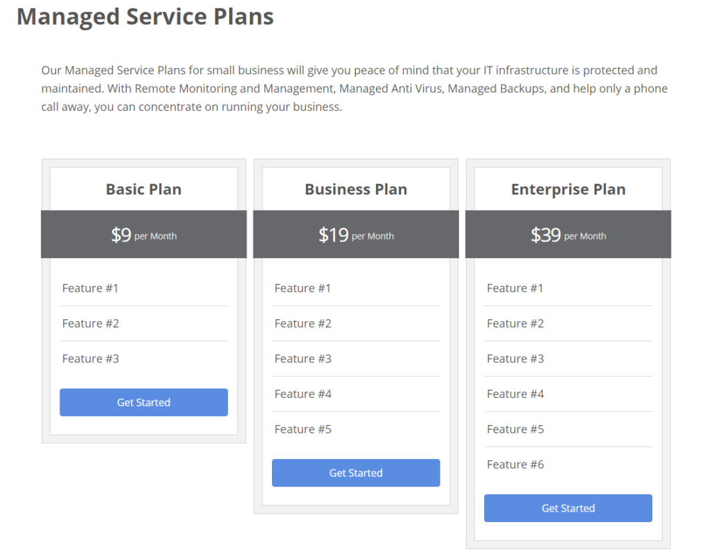
- Pricing Table - Creates a simple pricing table, like the one on our pricing page.
- Slideshow - Renders a slide show of images from either your Media Library or SmugMug.
- Menu - Renders a native WordPress menu with several display and formatting options.
This is a game changer folks. You now have professional website design features available in an easy-to-use interface. And this is just the tip of the iceberg!
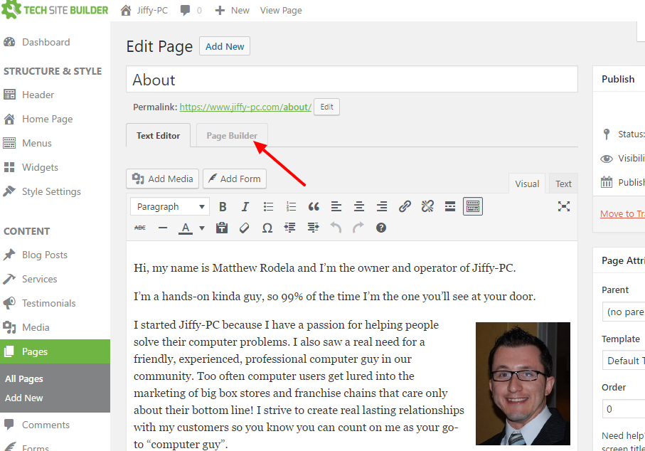
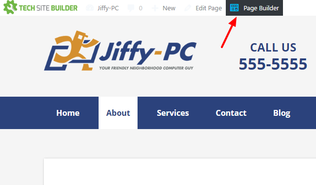
You can access the Page Builder in one of two ways:
Video Walk-through
And finally, here's a quick video walk-through of how the Page Builder works:
What do you think of the new page builder? Anything you wish it would do? Let us know in the comments below!