One of our primary goals here at Tech Site Builder is to make the experience of building a website as easy and hassle-free as possible. To that end, we’re happy to announce a new feature that should help speed-up and streamline the website build process.
A big frustration for many people when making changes to a website is that you don’t know what the end product is going to look like until you save your changes and view your website. By that time, your changes are already “live” and view-able to the public. This is not ideal.
We solved part of that problem with the implementation of the page builder last year. That allows you to edit the content of each page using a drag-and-drop editor that represents exactly what the finished page will look like.
But in order to update the other visual parts of your website, like the headers, colors, fonts, front page, widgets, menu, etc., you still needed to head to the good ol’ admin dashboard.
That changes today…
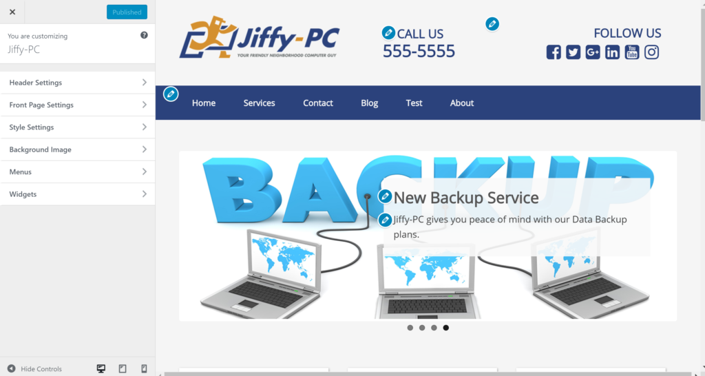
Introducing the Visual Customizer
With the Visual Customizer you can now make your overall site changes and see them applied in real time. We’ve migrated the Header, Home Page, and Style settings exclusively into the customizer.
Plus you can also make changes to your Navigation Menus and Widgets from the customizer as well (though you can still manage those two features from the dashboard like always).
Finally, there’s a new Background Image feature that you can use to set a texture, pattern, or photo background for your entire site.
Watch this walk-through to see how the new Visual Customizer works.
Some notable NEW features available in the customizer include:
Hundreds of Font Choices
In the customizer, head to the Styles menu and then the Basic sub-menu and you’ll see the drop-down menu for font selection has expanded to hundreds of choices!
Not sure what to choose? Head over to https://fonts.google.com/ and find something you like…chances are it will be available.
Preview Your Website in Mobile View
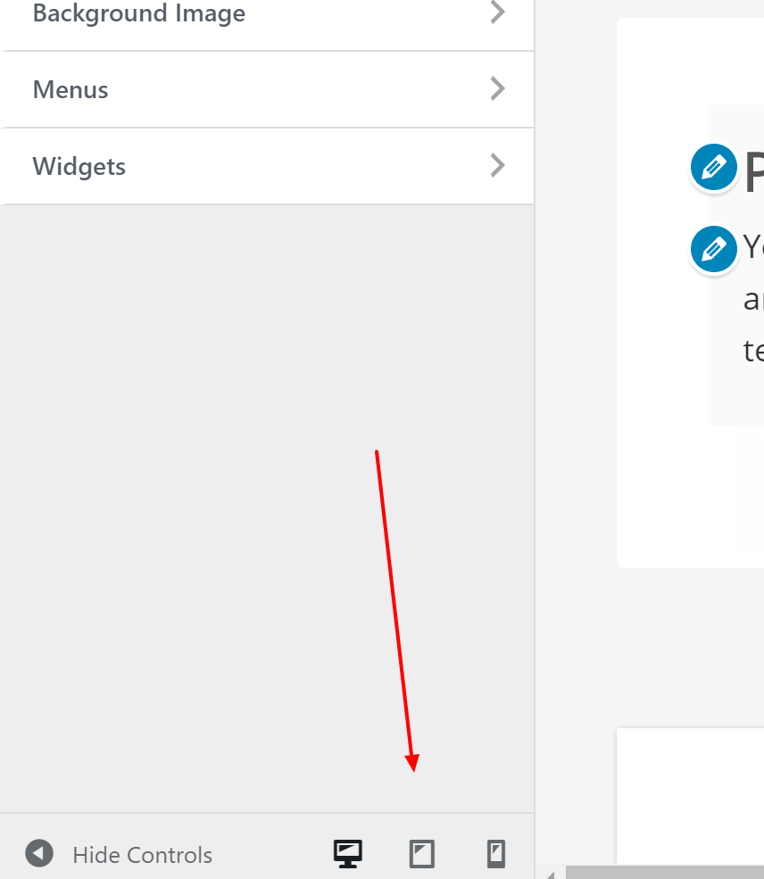 While in the customizer you may overlook the three little icons at the bottom of the screen. These represent desktop, tablet, and mobile phone screen sizes and allow you to switch between a simulation of what your website will look like on screens of those sizes.
Now you can make sure a change you made will look good on a mobile phone BEFORE you publish the change!
Share a draft of the changes you made before you make them live
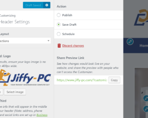 The little gear icon next to the Publish button in the customizer exposes a screen where you can save a draft of your current changes. Once you save your draft you’re then given a unique URL you can use to share your draft changes with others. The beautiful part is that your actual website will not change…so are free to make crazy changes and share them without worrying about your live website being affected.
On this same screen you can also schedule your changes to publish in the future. This all functions similarly to a blog post or page in the editor screen.
Take ‘er for a Spin!
Even if it’s been a while since you’ve updated your website…jump in and try out the new customizer. You just may find yourself with a renewed motivation to add that extra polish on to your well-worn website.
Speak Your Mind