
This trend has impacted everything from the way websites are now designed to your MSP site’s position in Google search rankings.
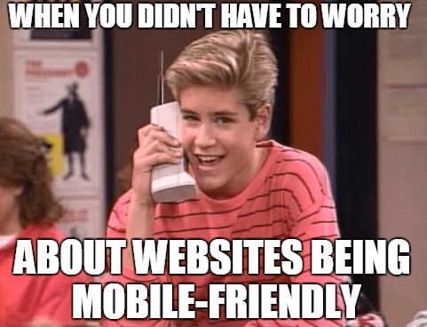
If your website isn’t exactly mobile friendly, it’s high time it is! We’ll tell you why and how to approach a “mobile makeover.”
Why the Move Towards Mobile-Friendly Sites?
Why do websites need to cater to mobile devices?
The fact is that mobile devices have now overtaken desktops and laptops for a majority of online activities. This makes mobile devices now the norm, rather than an exception that needs accommodating.
Statistics between 2013 and 2019 from BroadBrand Search, tell the story of mobile’s takeover from desktop computers:
- Mobile traffic has increased 222% over the last 7 years.
- Mobile percentage of organic search traffic is 58% (as of Q4 2019), which is an increase from 27% in 2013.
- In 2019, the e-commerce conversion rate for mobile (4.66%) exceeded that of desktop (4.14%).
As tablets and smartphones have become more powerful, people have been using them for all types of online activities. It’s just more convenient to sit on the sofa and shop from a tablet, than to pull out the laptop or go sit at your desk.
That desire for the convenience and flexibility of mobile devices has also made its way into the business world. Mobile apps are now used widely to handle many of the same tasks that computer applications can do.
According to Microsoft, mobile devices now handle approximately 80% of the daily work done in enterprise organizations.
Google recognized this trend a while back, and in April of 2015 it began penalizing websites that weren’t responsive for mobile searches by giving mobile-friendly pages preference. Honestly, this has been one of the biggest driver for companies to upgrade their sites. No one wants to get dinged in the search rankings!
How Your IT Business Suffers If Your Site Isn’t Mobile Friendly
The bottom line is that if your IT business website isn’t mobile-friendly, you’re behind the times and could be missing out on a lot of potential business.
While you may think your site looks “okay” on mobile, being able to see a site on a smartphone and having that site be responsive and easy to navigate on that device are two different things.
Here are several ways that your IT business could be suffering from a non-responsive website.
Missing Out on Local Searches & Revenue
Mobile devices and local searches are a matched pair these days. 88% of people that search for a local business on their mobile device end up calling or visiting. That’s a pretty impressive conversion rate.
If someone pulls out their phone to find the address to your computer repair shop, how easy will that be? If it’s difficult for them because your website isn’t mobile friendly, you could lose that walk-in sale to a competitor with a responsive site.
71% of people look up the address of a business on a smartphone before visiting for the first time.
More Difficult to Rank in Search Results
63% of Google organic searches in the U.S. are being done by mobile devices. Google uses two important ranking signals when it comes to mobile search:
- Whether or not a site is mobile-friendly
- Page speed on mobile
You can do the math and see that if your MSP business website is not responsive and not designed to be fast loading on mobile devices, you’re missing out on a lot of potential traffic.
Responsive sites are given preference over non-responsive for the results shown on a mobile search, which leaves your site pages only having a chance to rank for less than half the searches performed.
You’re Making It Harder for People to Call You
One handy feature of responsive sites is that when someone views them on a mobile device, they can simply click the phone number to call. This “one-click calling” is a feature that 70% of smartphone users say is crucial.
If you don’t have this capability because your site is non-responsive, people have to try switching from their phone’s browser to the dialing pad while typing in your number, and it makes your business a lot less convenient to contact.
Higher Bounce Rates
Are you experiencing high bounce rates on your website? A little digging might find that mobile visitors are leaving because your site isn’t responsive and doesn’t look good on their device.
High bounce rates not only mean you’re losing visitors that you may actually be paying for via your marketing efforts, it can also lead to overall worse search rankings (Even on desktop!).
Bounce rate is one of Google’s overall search ranking factors. So, if you have high bounces from your pages, it could hurt your desktop search rankings as well as mobile.
You Make Your IT Business Look Bad
Because you have a technology business, people will have higher standards for your company when it comes to anything technology related. This means that if you have a website not optimized for mobile, it can make your business as a whole look bad because you’ll be seen as being behind the times.
This could cause you to lose MSP clients who might wonder, “If this company can’t modernize their own website, how outdated will their MSP services be?”
All your MPS site’s webpages are a reflection of your business. If your site looks bad on mobile devices, then your company looks bad as a result.
Your Site Becomes “Broken” for Most Searchers
One of the big parts of any website is the navigation menu. People need to be able to click your links easily to find what they’re looking for.
If your site was not built to be responsive and mobile friendly, there is a good chance that if someone views it on a smartphone, they won’t be able to use the navigation menu that was designed for a desktop computer.
This essentially “breaks” your site for them, making it unusable for what we already know is a majority of the search traffic today.
Responsive sites are designed to adjust navigation features so they’re easy to use whether someone is on a desktop, tablet, or smartphone.
Steps for Doing a Mobile Makeover On Your MSP Site
Confirm Whether or Not Your Site is Responsive
First, you’ll want to confirm whether or not your site is responsive and functions well on a mobile device.
Some of the elements that go into responsive sites are:
- Site elements can resize dynamically to fit a device screen
- Navigation elements adjust so they’re usable on a small screen
- Page load time isn’t excessive on a smartphone
- The website design looks good on a mobile screen (i.e. no big white spaces where there should be text or an image)
- The website design looks good on a desktop
It’s good to always test your site directly by looking at it on your phone to get an idea of exactly what a potential customer might see. Check navigation, how pages look, and how easy it is to get around.
Here are some sites that you can use as well to test the responsiveness of your site:
Look at Responsive Options for Your Current Site
Having to redo your entire MSP website in a responsive format can be very time-consuming, so you want to look at the options you have that might only require a little tweaking.
For example, if you’re already using WordPress for your website, perhaps you just need to turn on responsive features in your theme. Or you may be able to switch to a responsive theme, and only have to do minor tweaks for theme differences.
Checking what your current site can or can’t do when it comes to being mobile friendly could save you a lot of work.
Look for a Hosted Website Builder
If you don’t have any responsive options for your current site setup, then your next best step to avoid a lot of time and money is a hosted webpage building service.
Services like Tech Site Builder give you a prebuilt responsive template for an MSP site and all you have to do is add your text and images. This type of service can allow you to get a mobile-friendly website up and running in as little a one hour.
Review Content Management Systems (CMS)
If you want to do a full redesign and have complete control over your responsive site, then you’ll want to use a CMS. Today’s responsive sites are powered by content management systems because they allow you to update your site easily in one place and will automatically deliver responsive pages that look good on all screen sizes.
The most popular of these by far is WordPress, but there are a few others. Here is a rundown of the top CMS options:
Test Your Site Speed for Mobile
Once you have a responsive site, that doesn’t mean you’re finished. You want to make sure your site isn’t slow loading on mobile. Mobile speed is one of those mobile search ranking signals.
Go to Google’s PageSpeed Insights tool and check your mobile page speed. If it’s slow, the site will give you suggested fixes to speed things up.
Keep Your Site Current With the Times!
When a site isn’t mobile friendly, it looks as if it’s back in the stone age of the internet. Make sure you’re keeping up with the devices that consumers are using to get online by making your website responsive.
Do you have any challenges when it comes to mobile-friendly sites? Add your thoughts in the comments!
Speak Your Mind