First impressions matter, and for many people, your website’s home page is going to be the first impression they get of your IT business.
If your home page looks boring or has little to say about why that person should consider your company for their needs, then they may never visit any other pages you have on your site.
This makes your home page one of the most important pages your website has. With these tips below, you can make it an inviting one that makes an excellent first impression and invites people to explore further.
How to Create the Ideal Home Page for Your IT Business Site
Your website’s home page is like the outside of a home. Houses that have lawns full of weeds and paint flaking off the siding are definitely not as inviting as the ones that have great curb appeal with beautifully manicured lawns.
A home page that’s dull, overloaded with text, or poorly designed, doesn’t have great curb appeal, and people will virtually drive right by. In the internet world, that’s clicking the “back” button.
While each page on your IT business website is important, your home page is one of the most important for your marketing engine to run smoothly. Because it’s from that page that people will decide whether to visit others, ones that are designed to capture their lead information or get them to contact you for managed services.
Here are some tips for making your home page the best it can be.
Design for Your Target Market
It’s important that your home page speak to your target market. For example, a computer shop that works mainly with residential clients is going to want a more friendly and less formal home page. One that has easy-to-understand messaging without a lot of IT jargon.
On the other hand, if your main target market is the corporate world, then you want a more formal home page that will make a B2B customer feel comfortable that your firm can meet enterprise-level IT needs.
For those MSP’s that have both business and residential clients, it doesn’t hurt to add navigation that would take one or the other to another page on the site designed specifically for them.
Address Pain Points & Solutions
Your home page is your first shot at getting someone interested enough to stay on your site and look around. So, you don’t want to lose their attention by staring off with paragraphs of text about your company without first addressing why they’re there.
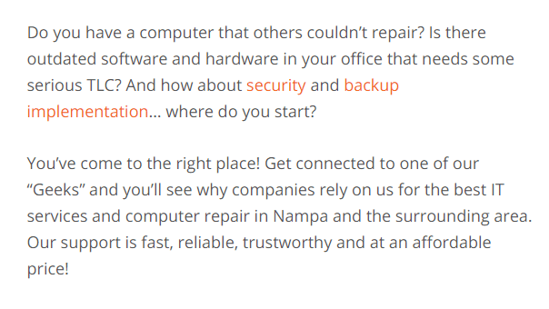
Address their pain points and your solutions up front. Such as, “Is malware becoming a big problem? Get help from the cybersecurity experts!” Or “Computer running slow? You’ve come to the right place!”
Here’s a great example of addressing pain points and solutions from Nampa, Idaho IT provider Connect2Geek:
Put Your Contact Details on the Home Page
When people are looking for a local business to call, especially if it’s an IT emergency, they’re going to look for your contact details on the home page.
Yes, you have them displayed nicely on your contact page, but they need to also be somewhere on your home page so someone can:
- Call you without having to go to another page
- Email you from your home page
- Quickly see if your location is convenient for them
44% of people will leave a website if the home page doesn’t have any contact details.
You should have your phone number at the very top of the home page. And if you can, your address in the top bar would also be convenient. But if it doesn’t quite fit there, put it in the footer, that’s where most people will look for a company’s physical address to be listed.
Make Sure Your MSP Home Page Looks Good on Mobile
Using a responsive WordPress theme doesn’t necessarily mean your site looks good on mobile. It’s important to view your home page on mobile yourself to ensure the page is attractive and the mobile menu is easy to navigate.
57% of consumers say they won’t recommend a business that has a site that is poorly designed on mobile.
Since your home page is one of the first places people are going to land when looking up your business online, check to make sure it looks good both on mobile and desktop.
If you want to do this from your computer instead of fishing out your phone, you can use the developer tools in your browser:
Have Clear Navigation
When people first land on your home page you have to imagine that they’ve been put in the middle of a strange city and are relying on your map to find what they need.
That map is your menu navigation, and you want it to be as clear and concise as possible. Avoid trying to be too clever with a menu. You can be pithy and original in other parts of your home page, but on the navigation, you want to be clear.
Your navigation will be based on your services and target audience needs. You may want to consider doing a dropdown mega menu for your services that allow people to click directly over to things like “Cloud Solutions” and “Network Security.” This gets people to the service they need faster, without having to go through a main services landing page first.
Navigation is a big one to double check on mobile to make sure it’s not problematic or frustrating when viewed on a smartphone.
Add a Little of Your Personality & Tell Who You Are
A few well-chosen words about what your company does can make a big difference in the number of leads your home page can help generate. People want to feel they can trust a company and it’s also nice if they think they’re likeable too.
While your home page isn’t your “About Us” page, so you don’t need to write an entire paragraph or two about yourself, you can still add a couple of sentences.
Telling a little about yourself and sprinkling in some personality encourages people to want to know more about your business and what you do and move deeper into the website past your home page.
I was looking for examples to provide of a good use of this on an MSP site, and you’d be surprised how may boring home pages there are out there that don’t even tell anything about who the company is or give a reason for people to want to know them more.
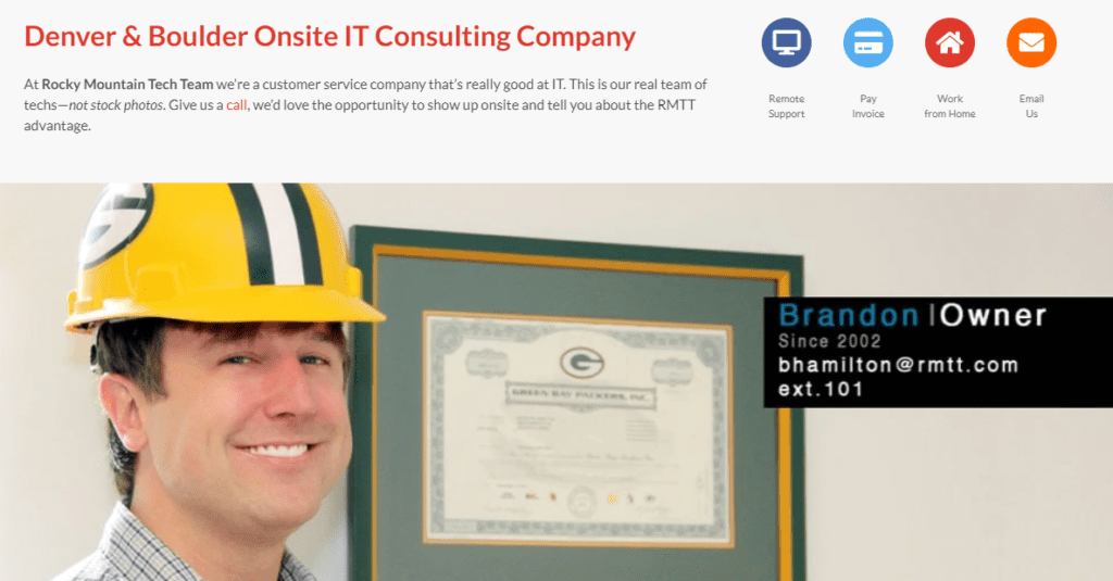
After a little bit of a search, I found the perfect example from Rocky Mountain Tech Team. They give just enough information about themselves on the home page that you already think they’d be cool to hang out with.
The snippet about them says, “At Rocky Mountain Tech Team we’re a customer service company that’s really good at IT. This is our real team of techs—not stock photos. Give us a call, we’d love the opportunity to show up onsite and tell you about the RMTT advantage.”
Have a Call to Action on Your Home Page
You may have other pages on your site that are designed to convert, but you have to remember that your home page is most likely the first people will land on, and some web searchers can’t be bothered with going further.
So, make it possible for a visitor to convert to a lead directly from your home page. You can do this by adding a form near the bottom of the page to send in a quote request or ask a question. You could also use a lead magnet designed to offer more value (e.g., free ebook, coupon, etc.) in exchange for an email address.
By adding a call to action to your home page, you can increase your conversion rate by capturing those busy people that never like to go past the first of a website.
Ensure a Fast 2-3 Second Load Time
Page speed is important for all your site pages, but especially for your home page. It should be the fastest loading page on your site to ensure people aren’t bouncing away because they are tired of waiting.
83% of people expect a webpage to load in 3 seconds or less. If yours is taking longer than that (on desktop AND mobile), then you can be assured you are losing potential leads.
You can use Google’s PageSpeed Insights tool to see how your page scores for both desktop and mobile loading and get recommendations to help speed up load time.
Write a Clear Headline at the Top
You want to grab someone’s attention right away when they land on your home page. It could be to reassure them they’re in the right place, like: “Denver’s Most Popular Windows & Mac Repair Shop.”
Or to invite them to scroll down more, such as: “We’re the Cybersecurity Experts You’ve Been Looking for Your Whole Life.”
Or you could make them a promise of a better world, like: “Put All Your Technology Problems Behind You!”
Your top headline should be short, strong, and reflect your value proposition to your most important target market.
Make a Great First Impression!
The impression your home page makes has a direct impact on the converting power of every other page on your website. It’s worth the effort to boost your internet curb appeal by optimizing your home page!
What’s your biggest challenge with your site’s home page? Share your thoughts in the comments.
Speak Your Mind