You’ve invested time and money to generate website traffic, but your leads are still only trickling in… the problem may be that your landing pages aren’t compelling website visitors to stick around or engage with your IT business.
The first page someone lands on when they’re driven to your website by pay-per-click ads, social media, or referrals is the most important. It’s got to grab them if you want to capture them as a lead.
If your landing pages aren’t properly optimized, that means you’re losing potential leads and sales and your ROI on marketing time and dollars won’t be very good. But if you follow some of the best practices for optimizing your landing pages, you can improve that ROI and get more business out of the traffic you’ve generated.
What are the Best Ways to Optimize My Landing Pages?
Your landing pages are distinct from your home page and contact page. They may double as your service pages, or you may decide to make them completely unique.
Landing pages are the pages on your site where you direct people from:
- Google Ad campaigns
- Social Media Posts or Ads
- Print Materials (Like Postcards)
- Other Marketing
The reason you want to send someone to a specific landing page rather than just sending everyone to the home page of your IT business website is so you can give visitors a more tailored message and have a better chance of converting them.
For example, say you’re running Google Ad campaigns for keywords like “antivirus help in Denver” and “business IT providers in Denver.” Each of those are distinct areas of your services for distinctly different customers.
If you land both campaigns on your home page, the message is not going to tell those visitors exactly what they want to know, so they may just click the “back” button instead of searching around.
Someone looking for antivirus help is going to have a better chance of converting to a sale if the landing page you direct them to is specifically about your antivirus services, with a call to action to sign up for a free virus scan.
For a potential business lead searching for business IT services, you want a landing page that talks about all the services you provide for companies, maybe with a few testimonials, and with a call to action to contact you for a quote or sign up for a plan.
While your standard home page is designed to give an overview of what you offer and tell people about your business, the purpose of your landing pages is to be a salesperson and generate leads.
Here are some best practices to adopt to keep those virtual salespeople sharp and converting website visitors to leads and sales.
Incorporate the Basic Elements
There are a few basic elements that you want to have on your landing pages. The text and other additional elements may change according to the audience and your goals, but these 5 elements below should be standard.
- Attention-Grabbing & Relevant Headline: Let your visitors know right away they’re in the right place while also drawing them in with a catchy headline.
- Attractive Image: Users are 80% more likely to read content when it’s paired with an image.
- Clear Product/Service Description: Keep your initial product/service description (the one at the top of the page) short, sweet, and to the point, you can add details below the fold.
- Call-To-Action: Have a purpose for your page, whether it’s to have a visitor request a quote, sign up for a Managed IT Plan, or give you their email in exchange for an eBook.
- Value Proposition: How is your product or service going to make their life better? Keep this in just one or two sentences to make it memorable. (i.e. “100% of our clients have never had a data breach since working with us.”)
Have a Clear Call-to-Action
Don’t make people guess what you’d like them to do, instead give them a clear direction on your landing page. Do you want them to sign up for a free security scan and give you their email address? Or to click to request a quote for managed IT services?
Decide what you want your main CTA to be and make it big and bold. Using a button is typical and can boost conversions by 45%. It’s also a good idea to test different button colors to see which converts better for you. Two of the most common high-converting button colors are orange and green.
Don’t put your CTA before your value proposition or description of your offer, people need a chance to see what you can do for them and read about your service/product before they decide to take action.
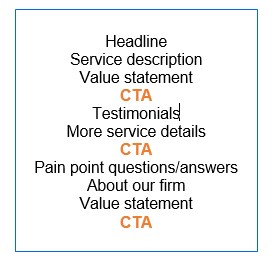
A common optimization technique for landing pages is to sprinkle the CTA a few times in the page, like this:
Be creative with your CTA text. For example, instead of “Click Here” use something like:
- Sign-up Now!
- Get My Free eBook
- Learn More
- Secure My Website
- Download Free Security Checklist
Keep Your Pages Fast
A gorgeous page that takes 10 seconds to load, isn’t going to convert many visitors, because most of them will get impatient and leave. Just a 1 second delay in loading your site can decrease conversions by 7%.
Over 59% of mobile users won’t wait longer than 6 seconds for a website to load before leaving.
You want to make sure your landing pages are some of the fastest on your site and that they’re optimized to load quickly not only on desktop but on mobile as well, since most local searchers are searching from their mobile device.
Use tools like Google Analytics and Google’s PageSpeed Insights tool to check your page speed and find tips for reducing load time.
Use Plenty of White Space
You want your landing page to be easy to read and not have tons of text that’s difficult for someone to get through, especially on a mobile device.
Make sure you have a good balance of white space between your images, text, and CTA buttons. You want your landing page to be simple and uncomplicated and your offer to be straight-forward and to the point.
Another best practice is to keep your paragraphs short, just 3 to 4 lines is optimum. Remember, many people will be reading your landing page from a mobile device and long paragraphs that go on forever will lose them and lose your point.
Make Sure Your Landing Page Matches the Referral
Have you ever been searching for something like “red tennis shoes” and clicked on a Google ad only to land on a page where there were no red tennis shoes in sight? That’s poor landing page relevancy and will not only cause visitors to leave it will also make your cost per click on Google Ads be higher.
Google rewards advertisers for page to keyword relevancy, and your visitors will too.
If you’re running a promoted campaign that’s triggered off the keyword “computer repairs in San Diego” you want to make sure that when your visitor clicks over to your site they don’t end up on a general page where they have to search for your repair services.
Instead, put them on a special repair service landing page and have a headline – front and center – that says something like… “If you’re looking for fast, quality computer repair in San Diego, you’ve come to the right place!”
By making your landing pages relevant to the traffic they’re generating, you not only have a much better chance at converting more leads, you’ll also help reduce your PPC costs.
Develop Trust with Social Proof
If someone just came to your site for the first time, they don’t even know you, so help them out and let them know they can trust you by incorporating some testimonials on your landing pages.
85% of consumers trust online reviews as much as a personal recommendation, and they’re especially helpful for local businesses, with 73% of consumers saying they trust a local business more if they have good reviews.
You can insert reviews in your landing page and still keep the design clean and uncluttered by using things like a quote call out or a carousel that shows one review at a time and rotates through about 3-5 of them.
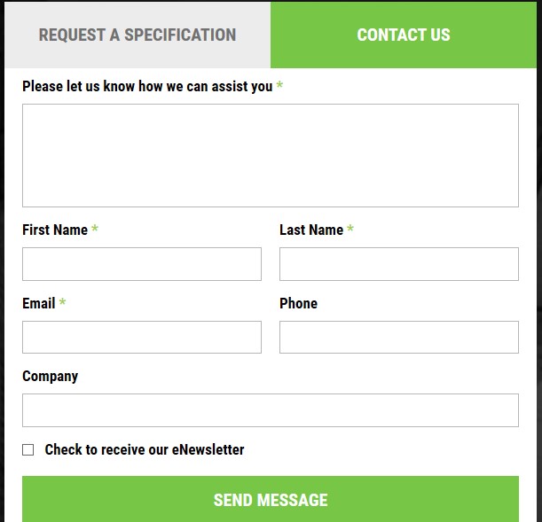
Add a Short Contact Form
Make it easy for someone to contact you from your landing page without having to look for your contact link in the main menu. Not everyone will be ready to take the action you’ve outlined in your CTA, so make it easy to ask questions.
Insert a form on your landing page that’s short and sweet and makes contacting you quick. And don’t ask them too many questions, keep the form fields to a minimum. According to WordStream, reducing the number of form fields from 11 to 4 can increase conversion rates by 120%.
Some WordPress themes that use tabbed containers allow you to have one main container that has a contact form on one tab and a quote or signup form in another, allowing you to give leads options but still keeping your landing page clean.
Use Good SEO Practices
You want to go farther than just optimizing the visual design of the site, and also use good technical SEO best practices. Something like using a main keyword in the url, such as “myITsite.com/computer-repair-services-san-diego,” not only helps your PPC page relevancy scores and your organic optimization, it’s another cue to the page visitor that they’re on a page that has exactly what they wanted.
Good technical SEO includes things like:
- Using keywords naturally throughout your text
- Using keywords in headers and sub-headers
- Optimizing your page description meta tag
- Using keywords in your ALT image tags
Add an Exit Popup
An exit popup can give someone “one last chance” to engage with your site before they leave. Putting the popup trigger upon the exit, ensures it won’t get in the way of them reading through your awesome landing page and will wait until they’re ready to part ways.
Generally, you just want to have a field for their email on an exit popup form to encourage them to take a few seconds to fill it out. A call-to-action for an exit popup might be:
- “Got 3 seconds? Get computer tips in your inbox weekly.”
- “Sign up for Microsoft & Google secrets!”
- “Stay informed! Don’t miss our monthly specials.”
- “Keep your office in the know with productivity tips.”
Make Your Landing Pages Special
Once you start treating your landing pages like the virtual salespeople that they are, you’ll find that your efforts are rewarded with more conversions and a better bottom line.
What challenges do you have with your landing pages? Have you made one that’s an excellent example for others? Let us know in the comments.
Speak Your Mind