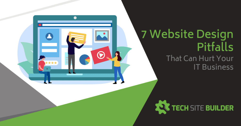
In this digital age, having a killer website is an absolute must for success. Your website is like your virtual storefront, representing your brand and reeling in potential clients.
But guess what? Many IT business owners are unknowingly making some common website design blunders. These mistakes can seriously hurt your online presence and, ultimately, your business.
Below, I’ll explore some of these pitfalls and provide practical tips to help you avoid them, ensuring that your website becomes a valuable asset rather than a liability.
Why Are Website Design & Usability So Important?
You might be thinking… “We get most of our business from referrals or walk-ins. Why spend time on our website?”
But today, most consumers and B2B buyers look for products and services online. They’ll typically start with a Google search and might see your Google Business Profile listing if you’ve optimized well. Then, they’ll click over to your website to see what you’re all about.
A website that’s difficult to navigate or that looks basic and lackluster reflects not only on your web design skills. It’s a direct reflection of the experience they can expect to have if they hire you.
If your site looks like you didn’t put much time into it, then a prospect may think that if they sign up for your managed cybersecurity services, they’ll get the same subpar experience.
Here are a few statistics that show why you need to pay attention to your website design:
- 42% of people will leave a website that has poor functionality.
- 85% of consumers say pictures are important to them when deciding on a business to buy from.
- 73% of web designers say that a website being non-responsive is a top reason people abandon it.
What mistakes might you be making with your website that are hurting your sales?
Website Design Pitfalls & How to Fix Them
Poor Navigation and Structure
One of the most critical aspects of a well-designed website is intuitive navigation and a clear site structure. Visitors should be able to easily find the information they are looking for, and your website’s structure should reflect the logical flow of your business.
Few things are more frustrating to someone looking for IT help, than not being able to find the service they’re looking for easily on your site. Failing to provide clear navigation can lead to frustrated users and high bounce rates.
To avoid this pitfall, start by organizing your content into logical categories and create a simple, easy-to-follow menu structure. Use descriptive labels for navigation links, avoiding jargon or ambiguous terms.

Implement search functionality to enable users to find specific information quickly. Regularly test your website’s navigation by soliciting feedback from users and using it yourself from time to time. When is the last time you checked out your own website from a customer’s point of view?
Inadequate Mobile Optimization
With the increasing use of smartphones and tablets, optimizing your website for mobile devices is no longer optional—it’s essential. Not providing a seamless mobile experience can result in a significant loss of potential clients and adversely affect your search engine rankings. And just using a website template that says it’s responsive, isn’t enough.
Check your website from your smartphone. Does it look good? Can you use the navigation menu to get to your service pages?
Mobile has become increasingly popular and searches via mobile now surpass desktop. Sixty-four percent of online data traffic is from mobile devices, and one SEO study found that mobile results have an 85% higher click-through rate than desktop results.
Some tips to ensure your website is fully responsive, automatically adjusting its layout and content to fit various screen sizes, are:
- Optimize page loading speed, as slow-loading pages can frustrate mobile users.
- Simplify forms to minimize the need for typing on mobile devices.
- Test your website on different mobile devices and operating systems to ensure consistent performance.
Lack of a Clear Call-to-Action
A website without a clear call-to-action (CTA) is like a ship without a destination. Your website should guide visitors toward specific actions, such as contacting you, requesting a quote, or signing up for a newsletter. Failing to provide compelling CTAs can result in missed opportunities and a lack of conversions.
Place strategic and visually appealing CTAs throughout your website, making them easy to spot. Use action-oriented language to prompt visitors to take the desired action. Ensure that the CTA buttons are large enough and contrasting in color to grab attention. Test different CTAs and monitor their performance to optimize conversion rates continually.
Here is a great example from our sister website Techblogbuilder.com.
Notice how the first CTA to watch a video (to learn more about the product) is placed above the final CTA that leads to the sales page. The path is designed to build trust first, then ask for the sale.


Overloading with Technical Jargon
As an IT business owner, it’s easy to fall into the trap of using technical jargon on your website, assuming that everyone understands it. However, your target audience may consist of both technical and non-technical individuals. Using excessive technical language can confuse and alienate potential clients, leading them to seek services elsewhere.
Strive for clear and concise communication on your website. Avoid unnecessary technical terms or explain them in plain language. Use visual aids, such as infographics or videos, to simplify complex concepts. Tailor your content to your target audience, keeping in mind their level of technical knowledge.
Lack of Detailed Service Pages
Many MSPs discuss their services on a single service page on their site that lists everything they do. Having an overview page is great, but it’s a big mistake to not also have each service linked out to its own page.
For one, when you have just one service page, it hurts your SEO. You’re not able to properly optimize for keywords relating to a specific area, such as cybersecurity or virus removal.
Second, it won’t give prospective clients enough information in most cases. Having each service on a unique page allows you to better make the case for the need for that service and offer a value proposition. Plus, you’ll have plenty of room to display a video or testimonial specific to that service.
It can seem overwhelming to build out full web pages for all your services at once. So, approach it one service at a time. Prioritize the project by your most important services first, add those pages to your site, then work on others. You can also get help writing and posting those pages from an MSP content marketing service.
Prioritizing Visual Aesthetics Over User Experience
An important design element for today’s websites is to have plenty of visuals. This means quality images and easy-to-watch video content pertinent to the page the viewer is reading.
However, these visual elements must be balanced with user experience. Many MSP website owners will put up “heavy” images, not bothering to have them size-optimized, which causes the webpage to take longer to load. This ruins the user experience and defeats the purpose of the visuals because people might not stick around to see them.
Images, videos, and other similar elements need to be optimized to work well for the overall user experience. Images can be optimized to still look sharp without being so large they negatively impact page load speed. Videos can be embedded in a way to ensure they’re not dragging your site optimization down.
Here is an overview of how to do that from a “techy” perspective. This may be another area where it’s faster and cheaper to call in a professional that already knows all this stuff than to try to figure it out yourself.
Not Investing in Customization
Does your website look “cookie-cutter?” You know, like it was made in less than an hour from one of those WordPress built-in templates? If you don’t customize your site to reflect your brand, then it will blend in with other generic sites when someone is online comparing IT services in your area.
You can still use a template to save time and cost, but make sure you brand and customize your site using your logo colors and your company’s unique voice and value proposition. Make it memorable to visit your site, and people will remember you over your competitors.
Read more: “Why is Branding So Important for Your IT Business Site?”
Improve Your Online Presence & Sales Will Follow
A well-designed website can be a powerful tool for your IT business, attracting clients, establishing credibility, and driving growth. By avoiding common website design pitfalls, you can ensure that your online presence aligns with your business goals and enhances your brand reputation.
Need some help with website design or content? Check out Tech Marketing Engine for à la carte marketing solutions to supercharge your business.
What’s the biggest challenge when it comes to driving sales from your website? Share your thoughts in the comments.
Speak Your Mind