The logo for your computer services business can be memorable or forgettable, depending upon the design. A logo is more than just something that goes on your business cards and website, it’s a symbol that represents your business and brand personality to people in a single glance.
Things like the fonts you use, colors, and style can work in your favor to immediately give a good impression of your company. They can also do the opposite if they’re not thoughtfully put together.
Need a great, killer logo to make your tech business stand out from the competition? We’ll go through several tips below to help you land on something that represents your business and is memorable to your customers.
Where Can I Get a Great Logo for My Business?
The human brain processes images 60,000 times faster than words. Having a strong logo that can represent your business at a glance helps you get noticed and remembered as potential customers are searching through several IT business websites in your area.
Your logo is the cornerstone of your business branding and the oil in your tech marketing engine that keeps everything running smoothly. Having a memorable logo will also naturally boost all your other branding instantly (website, social media, brochures, etc.).
Think of some of the logos that you recognize immediately without even needing to see the company name:
- Yellow “M” (McDonalds)
- Red and white target (Target)
- Blue outline of a bird (Twitter)
- Swish (Nike)
While these are all iconic brands, that doesn’t mean a small business can’t also have a logo that’s just as memorable in their local area. It just takes being thoughtful about your logo design and following a few tried and true design tips.
We’re going to start with the most obvious ways to get a business logo, but if these just don’t work for you, read on for our tips on designing a logo for yourself.
Have It Designed by a Professional
If you can, then having a professional design your logo for you can offer a fresh perspective that you may not have considered. Freelance designers will also typically ensure that you have a high enough resolution of your logo that you can size it up even for large banners without it losing quality.
Professionals will vary widely according to talent, so you’ll want to be sure to check out their portfolio of references and ask questions, such as, “What is the turnaround time?” and “Are there are any additional costs for edits or rework to a design?”
You can expect to pay anywhere from $300 to $2,500+ to have your logo designed professionally. At the low end are newer freelance designers that haven’t yet built up a large portfolio and at the top of the price range are design agencies that have multiple creative pros on staff.
Use an Online Logo Creator
If you can’t afford a professional logo designer, you could try a do-it-yourself online logo creator. These sites are usually free to use and will charge you anywhere between $20-$65 to download high resolution artwork for the logo you make with their online tool.
The downside is that they tend to be limited in the images you can choose, and you may end up with a logo that looks like stock art. The upside is that they can give you multiple ideas to help jump start your creative process and are significantly less expensive than having a logo made by a professional designer.
Here are some online logo makers you can try:
How to Make a Great Logo Yourself
If paying for a logo isn’t in the budget or you’d rather make it yourself, then knowing a few good logo design tips and tricks can help you go from mediocre to stunning when designing your tech business logo.
Customers form a first impression of a brand’s logo within 10 seconds.
Here are some guidelines to help you create a logo that you’re proud to display and that will make an indelible mark on your leads and customers.
1. Use Colors Sparingly
Be careful of using too many colors in your logo. The sharpest looking ones use just a couple of colors that compliment each other. 85% of leading brands use only one or two colors in their logo.
What are the two most popular logo colors? Red and blue.
There’s an 80% bump in brand recognition when color is used in a logo, so you do want to use at least one color.
When choosing your color(s), it’s a good idea to do a little research on color psychology to help you choose wisely. For example, blue is representative of trust and orange of optimism.
2. Make Sure Your Logo Looks Good in Black & White
We just told you to use a color, right? Well, even though you have a color logo, there are going to be those times when it’s printed in black or white, so you want to make sure it looks crisp when not in color and that the details still come out when in black/white or greyscale.
3. Ensure It Matches Your Customer & Brand Persona
If you’re a computer repair shop in Oregon that works with residential customers, you might want a logo that’s more down to earth and relatable for the average home user.
But if you’re an IT professional in Boston and you work exclusively with business clients, then you’d want something more upscale and professional looking.
Think about your target customers and how you want them to perceive you:
- Bold or understated?
- Business or residential?
- Upscale or down to earth?
You can use similar imagery with very different styles that help position your services to attract the type of clients you’re looking for.
4. Pay Attention to Font Choice
The font you choose for your logo is just as important as the image. If you use Gigi in your logo it’s going to send a very different message than if you use Impact.

In a study of mobile phone ads, it was found that using a more condensed typeface to describe the slim nature of the phone performed 27% better than a wider font.
Just like colors, fonts can also send messages according to how they look (wide, thin, rounded, sharp, etc.). For example:
- Bold fonts = power
- Light fonts = beauty
- Rounded fonts = comfort, softness
- Angular fonts = formality, durability
- Short fonts = stability
- Tall fonts = aspiration
5. Keep Your Logo Simple and Readable
If you have a logo with too much detail, then when you scale it down to fit a smaller area, you’re going to lose a lot of that detail and it’s going to be hard to see. Keep any images used simple so they’re recognizable even if they’re at 200×200 pixels.
You also want to make sure your business name can be read at various logo sizes, so it’s a good idea to test your logo at both larger and smaller scales before finalizing your design.
Simplicity includes not using gradients or shadows, which may look cool at first glance, but won’t translate well when your logo needs to be printed in black/white or put on a colored background, like on a polo shirt.
6. Search for Ideas on Stock Photo Sites
Stock photo sites aren’t just for finding great images, most of them also have vector graphics that you can use for logos. When searching on a keyword, click the image type menu and choose vector or illustration to find images that could be used in a logo design.
You can also try using “logo” in the keyword search. Just be careful about leaning too heavily on a stock photo and make sure you’ve got other unique elements in your font and colors because you don’t want your logo to look just like one for another tech business.
Here are a few sites that offer searches for vectors or illustrations:
7. Be Authentic
If everyone else is using a globe or computer in their logo, then yours won’t stand out if you do as well. You want your logo to be unique so that it stands out from the competition, while also aligning with your brand.
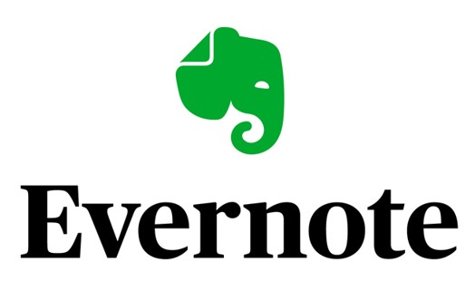
For example, think of the Evernote logo. It’s an elephant, which is something you don’t immediately think of for file storage, but it’s unique and memorable. Elephants never forget and Evernote is a way to never forget your files, which is a clever way to differentiate themselves with a completely unique logo that also aligns with their business.

Think outside of the box when it comes to your logo and go beyond the obvious images.
8. Consider Where You’ll Be Using Your Logo
If your logo looks great on your website but horrible on a hat, you’ll be limiting yourself with how you can use your logo. You want it to be flexible enough to be used in multiple different mediums – print, web, products, letterhead, etc.
A great way to test how your logo will look on different items is to upload your logo draft to sites like CafePress or Teespring. They allow you to see how your graphic will look on multiple different types of merchandise with various colors and backgrounds. This will help you land on a logo design that can work in multiple formats.
9. Design in Vector
If you design your logo in Vector, you’ll be able to size it as large as you like without losing resolution. One of the biggest mistakes that novices make is to create their logo as a jpg at a resolution that can’t be sized up without looking blurry.
They’re stuck with having to do a redesign if they want to use it for something like a large storefront sign or banner.
Some popular vector graphics programs you can use are:
10. Use Your Own Focus Group
There’s a reason that movie studies and marketers use focus groups. They help marketers with insight into what an audience thinks and can help them take a step back and see things from a different perspective.
You may think your logo looks wonderful, but a focus group of your friends and family may have some input to make it even better.
It’s a good idea to make between 3 to 4 logo variations (using different fonts, colors, images, etc.) and then have your own focus group give their input on them. If one of your logo options is being chosen by a majority, you’ll know that’s the one to use. A focus group can also give you great ideas, such as “try this font, but make it blue instead of green.”
Don’t Rush Your Logo!
A logo is something your business is going to be using for a while. Make sure not to rush the process and take your time creating something memorable that reflects your company personality and that you’ll be proud to use for years to come.
What are some of your favorite logos used by other tech businesses? Share your thoughts in the comments.
Speak Your Mind