One of the most important lead generation areas of your MSP business website is your contact form. It’s often the first place that people go when they want to reach out to you for IT help.
If you have a problematic form or one that asks too many questions it could be costing you leads. People may take one look at your form and give up without contacting you at all.
Learn how to create awesome website forms that will invite people to connect with your business instead of sending them away.
Creating Inviting & Engaging Website Forms
Your IT business website is a vital part of your marketing engine. It’s where just about any content you put out – social posts, guest blogs, infographics, etc. – are directing people.
Your website is your “home base” in the online world and your contact form is one of the most important ways you turn someone from a site visitor to a real live lead.
The main form you use on your site is more than just a mandatory part of your contact page, it’s the invitation (or barrier) for people to reach out to you for their IT needs.
The rest of your site can be great, but if you don’t put much thought into the form(s) you’re asking people to fill out on your page, you could be losing a lot of potential leads.
Over 67% of site visitors will abandon a form if they hit any complications at all and 47% of those people won’t contact the company another way.
Having forms that facilitate the contact process is vital to converting as many leads as possible that come through your MSP sales funnel.
Following, are several ways to make your forms the best they can be, so they convert more leads and sales.
Don’t Make Forms Too Long
Studies show that the longer forms are, the more people abandon them. You have to remember that a majority of people are searching for businesses via mobile. So, a form that might not look that long on a desktop computer, can seem like a lot of work when you’re viewing it on a smart phone.
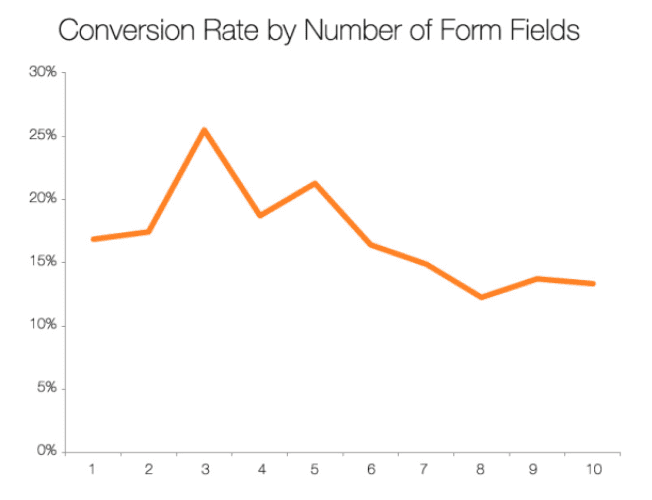
A HubSpot study found that between 3 to 5 form fields was the sweet spot before conversions begin going down significantly. Just going from 6 to 3 fields can improve conversions by 10%.

When it comes to your contact form, it’s natural to want to collect as much data as possible to segment leads, but you need to balance that with adding so many fields that it causes form abandonment.
Make Sure the Page Isn’t Too Busy
If you have too much happening with the page your form is on, it can distract people or cause them to miss your form all together.
Your contact form should be the main star of your contact page, so don’t try to turn it into an “about us” page or put a huge map at the top that people have to scroll past before they can see your form to fill out.
Make it as easy for people to get to your form as possible without wading through a bunch of unnecessary information.
Use a Title & Introduction
Without adding too much text, it’s inviting for a user to add a title and short introduction to your contact page above your form.
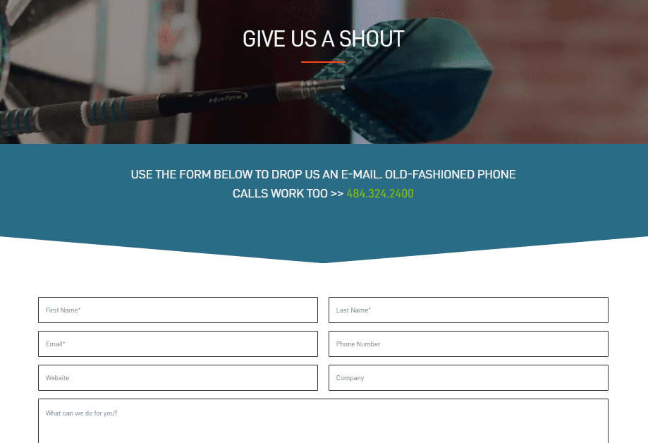
This can be something as simple as “Give Us a Shout,” which is used by Media Proper.
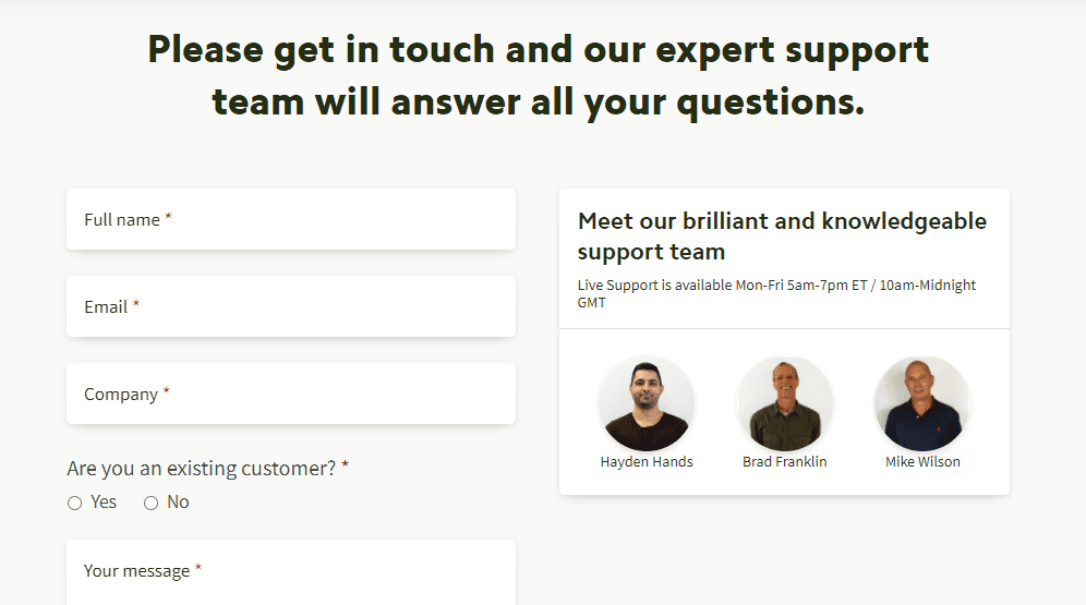
You can also try describing what contacting you will do. For example, getting all your questions answered by an expert support team, as this contact page from BrightLocal notes. It also includes live support hours and team photos. But note that the page is still very clean, and the emphasis is on the contact form.
A good contact page title and introduction can encourage someone to fill out your form and also splash a little of your MSP branding and personality on the page.
Try More Than One Type of Form on Your Site
When you receive contacts from your website, some people will send in just a sentence or two, while others will send you several paragraphs about their IT needs.
People are different, so your contact forms should differ as well to accommodate everyone. This means try adding a main contact form on your contact page, as well as shorter forms on specific site landing pages.
For example, you may have a form that asks only for name and email to sign up for a free audit on your cybersecurity page.
You can increase your conversion rates by up to 100% by removing navigation from a landing page and adding a form on the page for contact instead of making a visitor click through to another page.
Use Dividers Between Questions
You can break up lines of text on your form by adding a divider in a non-distracting color (like a light grey) between questions.
This can make a form with several questions seem less overwhelming and helps the visitor focus on just one form field at a time.
Choose a Good Call to Action on Your Form Button (Not “Submit”)
Don’t just allow your form button to default to “submit.” Using “submit” instead of a catchier CTA on your form button can reduce conversion rates as much as 3%.
Also, studies show that writing the CTA in first person can increase conversion rates by as much as 25%.
You want your form’s call to action button to make someone feel good about clicking that button and to know that something great is going to happen after they do.
Instead of “send” or “submit” try button text such as:
- Get My Question Answered
- Let’s Get Started!
- Claim My Free Audit
- Activate IT Help!
Pay Attention to Field Position
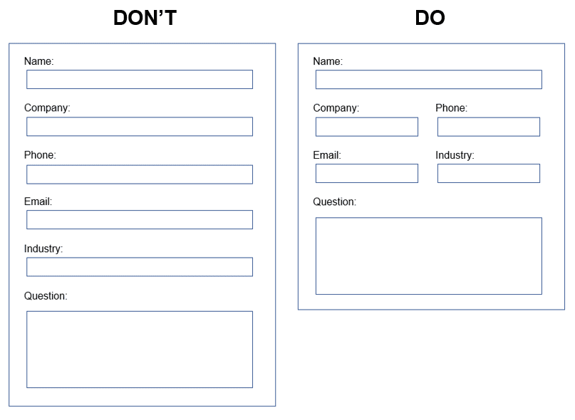
One of the things that can drive someone creating a webform crazy is how to position fields side by side. If they’re not sure how to do it, they might just leave all fields the same size, making the form look longer and more onerous to fill out.
For shorter fields, you want to position two or three next to each other on the same line. This reduces the scrolling someone has to do to get through the form and makes it easier for them to fill out.
Examples of a Don’t and a Do:

Mark as Few Fields as Possible as “Required”
The more fields you require, the more chance someone will leave your form entirely. I know that I always bristle when I see a form that requires my phone number. I immediately imagine being hounded by spam calls.
Asking for a phone number can reduce form conversion rates by up to 5%.
You should only require as few fields as possible, and by require, I mean that the form won’t submit unless the user fills in that field. In most cases, just the user email or name and email should be required.
Make Sure Your Contact Page Loads Fast
Nothing drives a person away from a site faster than a page being slow loading. If a page loads in just 4 seconds instead of 3, bounce rate triples.
Your contact page should be one of the fastest on your site. You want it to load near instantly, so you don’t lose leads.
This means that you should avoid:
- Large, heavy images
- Call-ins from 3rd party mapping apps that slow the page
- Videos or other media that slows load time
- Poorly coded form tools
You can check your contact page load time using Google PageSpeed Insights. It will give you load times on both mobile and desktop as well as tips for making the page faster to load.
Don’t Leave Out the Thank You Page
Many forms have a built in “Thank You for your submission” that pops up after the visitor has sent the form, but it doesn’t take them to a “Thank You” page.
Having forms go to a specific Thank You page gives you an opportunity to provide more information for your visitor as well as offer up some helpful content.
For example, you might add to your contact page that submissions are answered within 1-2 hours during business hours and within the next business day during non-business hours, so they’ll know when to expect a reply.
You might also add a testimonial or two to the form Thank You page to add social proof for your business and build trust.
Thank You pages also allow you to track form conversions and are very helpful for tracking goals in Google analytics.
Here’s an example: If you have two forms and set up a slightly different Thank You page for each one, you can then use those page URLs to set up conversion goals in Google analytics and track form conversions between each one separately. This is great for A/B testing of forms.
Take Time to Design an Effective Contact Form
The time and effort you put into contact form layout and design will pay off in more of your site visitors converting to leads.
What’s your biggest contact form challenge? Add your thoughts in the comments!


Speak Your Mind