When you’re creating landing pages, blogs, and other content, you generally have something in mind that you’d like your users to do. How do they know what that is?
The Call to Action!
“Click here to learn more!”, “Call to get your deal today”, “Sign up here”… these are all examples of a call to action telling the reader what you’d like them to do in relation to your content.
Knowing how to effectively use a call to action can drive more conversions and leads and make your entire marketing strategy much more effective. Not using them or using them poorly, can do just the opposite.
Why Using a Call to Action is So Important & How to Do It Right
Let’s say that Fred wrote a great blog post about ransomware to help promote a new anti-malware tool he was selling. He posted it on his website, social media, and LinkedIn, and sent it by email to get maximum blog benefit. While the post received several “likes” and “shares,” Fred didn’t get a single sale for the software and wondered what could be wrong?
It turns out his post was missing an important element, the call to action. So, people read through it, thought it was great, but didn’t receive any further instruction, so they moved on.
Having a call to action on every piece of marketing content you create is crucial if you want the reader to actually buy a product or service, give you their email to receive more information, or take another action.
The definition of the call to action is literally what it says. It’s a call for your reader to take a specific action.
If Fred had added a button to the end of his posts with the text “Buy Ransomware Protection Today!”, he would’ve most likely gotten some of those sales he was looking for.
Emails using a single call to action have been shown to increase sales 1,617%.
How do you write killer calls to action and use them properly for the biggest impact? We’ll go through several tips below to help you make the most of your content by capping it off with an awesome call to action.
How Many Calls to Action Should You Use?
One mistake that tech business owners make is using too many calls to action (CTAs) on their webpage or post. They might have a note with their phone number to call, a button to click to sign up for their newsletter, and another link to check out their managed IT services.
Giving too many instructions to the reader just confuses them and makes all the CTAs on the page less effective, so in most cases, you want to use a single call to action that’s clear and concise.
However, that being said, there are some cases where you might want to add a second choice, especially if the initial call to action is making a purchase. In that case you may want to give them two options side-by-side, one to “Buy Now” and one to “Request More Information” so you don’t lose the leads who might not be ready to purchase yet.
- Best to use 1 CTA: If the option is an easy one without a large commitment, like sign up for newsletter, get a free eBook, request a free consultation.
- May want to use 2 CTAs: If the first option involves them buying something or committing to something like a managed services plan, then give them another option with less commitment needed.
Where Should You Position Your Call to Action?
There are a few different strategies to the placement of an effective call to action on a landing page or post. Some sites will use them multiple places as you’re reading down the page, others will have them pop up as you’re leaving.
Here are two main rules of thumb for CTA position:
- Put it above the fold on the webpage so it’s not missed, but also lower if your page goes on further.
- Use it after you’ve mentioned a value proposition
Let’s dive a bit deeper into those rules of thumb.
There is some disagreement online about putting the CTA above or below the fold. In a study by MECLABS, they found that as long as they had a strong value proposition, that putting the CTA button at the very bottom of the page provided a 220% higher conversion rate than a less clear value statement and a higher CTA.
In our opinion, you want to use common sense. For example, there’s no reason to tell someone what action to take based upon your content if you haven’t yet given them a chance to read it. You also don’t want to put the CTA too low, because heatmaps showing user scroll patterns typically show that users tend to drop off the longer the content gets.
So, if you have a longer blog post or landing page, use a CTA before the fold and at the end of the content, and make sure you give them a value proposition before the first CTA.

What Should a CTA Look Like?
You can use text CTAs, however the most popular and engaging are in the form of buttons. A call to action in button rather than text form can increase conversions by 45%.
Your goal is to make the CTA stand out and get the person to want to click to take action, so using pleasing colors and button styles are key.
Here are some tips for attractive CTA buttons:
- Make sure the color doesn’t clash with your website
- Make it look “clickable” i.e. with shadowing
- Use a high contrasting color that will stand out
- Don’t make it too small
- Make the text large and legible
- Use compelling text (more on this next!)
A tip for finding the best color for your call to action button is to study recommendations for add to cart buttons. For example, this study by Amasty on the most popular cart button colors for consumer electronics sellers showed:
- Green (21%)
- Red (21%)
- Orange (17%)
- Blue (12%)
- Yellow (12%)
- Other (12%)
- Grey (5%)
Tips for Great Call to Action Text
How you express your CTA is just as important as how it looks. A weak call to action, like “Subscribe to Our Newsletter” is not going to excite someone as much as “Get Cost-Saving Tips in Your Inbox Weekly.”
We’re going to go over some tips first on writing great CTAs then give you some examples of attention-grabbers.
Use First Person Language
The use of a first person CTA, like “Get My Free Security Assessment” instead of a second person CTA, like “Get Your Free Security Assessment” results in a 90% increase in clicks.
Use Action Words
You want to create a sense of “action” with your call to action, so instead of using words like “submit” or “get” use words like “download” or “sign up.” Some examples of CTAs with good use of action words are:
- Sign up for our cybersecurity training today
- Download my free eBook on password security
- Start your managed services plan now
Tell Readers When to Take the Action
When do you want someone to sign up for your managed antivirus? Next week? No, of course not, you want them to do it as fast as possible, preferably now. So, tell them that in your CTA.
Using “now” or “today” can get users to respond sooner and give them a sense of urgency. Other ways to add urgency into your CTAs can be done in conjunction with an offer using terms like “Don’t miss out” or “Offer ends soon.”
Don’t Get to Wordy
The area above your CTA is where you want to give your value statement and talk about your product or service, the CTA itself should be clear, concise, and give a direct command of an action to take.
- CTA that’s too long: “Sign Up for Managed Backup Now and Get 30% Off Your First Month!”
- Better CTA: “Save 30% & Get Managed Backup Now!”
Examples of Great Calls to Action
A good way to write your own CTAs is to study those that are well done and immediately draw you in. We’ve taken a look at several CTAs to bring you some killer examples.
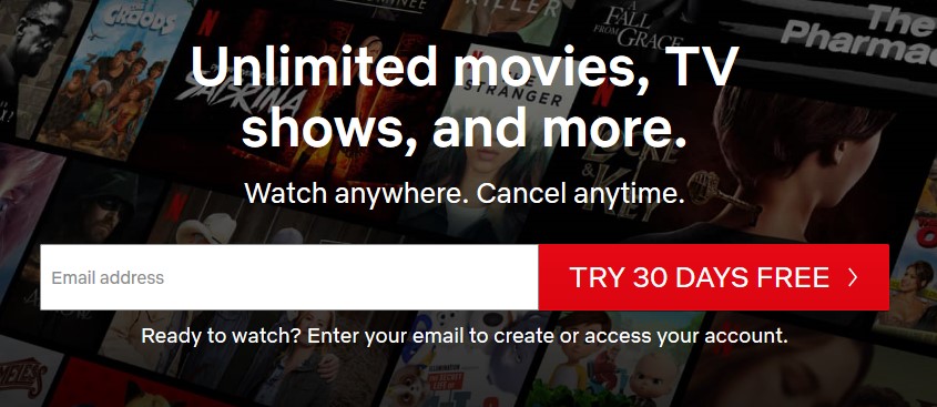
Netflix: CTA: “Try 30 Days Free”
You can’t get a much more clear, concise, and to the point value statement and CTA than the one by Netflix. Their page format is: value statement, CTA, more information, the same CTA repeated at the bottom of page.
Tech Blog Builder: CTA1: “Order My Blog Posts” CTA2: “Learn More”
Hey, these guys look familiar! Yes, it’s our sister site Tech Blog Builder and I included this because it gives a great example of how to use two CTAs together. You can tell by the color choices, they’d really like you to “order my blog posts” (notice the use of 1st person), but if you’re not ready to buy yet, they give you another option you can take.
Connected Platforms: CTA: “Let’s grab a coffee and chat!”
What we love about this call to action from IT managed services provider Connected Platforms is that it’s completely original and represents thinking out of the box. Who wouldn’t want to grab a coffee and chat?
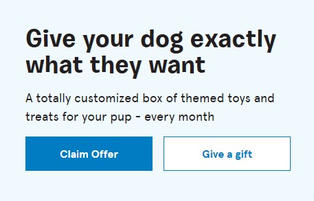
BarkBox: CTA1: “Claim Offer” CTA2: “Give a Gift”
BarkBox uses the double CTA a little differently to match their demographic, which is some customers that buy for their own pets and some that give their box as a gift. Their “claim offer” has an air of mystery to it that is bound to drive some curiosity clicks.
Find more great CTA examples to study at the sites below:
Take Time Crafting Your CTAs
Your calls to action shouldn’t be an afterthought that you stick at the end of your page. Take time to craft several of them and use them throughout your content marketing to drive more clicks and leads.
What are some of your favorite CTAs? We’ve love to see them!


A good reminder of the need to do this well in order to maximise conversions