The market for managed IT services for the residential market has never been hotter. You’ve got a great solution for all those at home workers and students to keep their PCs running effectively, but how do you get the point across?
Knowing that you can help is one thing but creating a webpage that effectively explains why a visitor needs to have a managed service plan at home and gets them to sign up is another.
If you’ve been wanting to sign up more residential MSP customers, we’ve got several tips for you to build a killer webpage that will help you drive conversions.
Elements of an Effective Residential MSP Landing Page
The landscape of where people work, go to school, and even watch the latest movie releases has changed drastically due to the COVID-19 pandemic. Even though states are cautiously reopening various services, this is a change that’s going to be impacting technology use for quite a while.
Home internet and cloud app use has gone up across the board dramatically over the last several weeks. This means more reliance on home computers and networks and more need for residential I.T. support and security.
According to the New York Times, here are some of the shifts that have been seen in home technology use over end February to late March 2020 due to the coronavirus:
- Zoom daily app sessions increased from about 2 million to nearly 7 million
- Social apps like Nextdoor.com and Houseparty saw an increase in daily traffic of 73.3% to 79.4%
- Google Classroom daily sessions jumped from below 2 million to about 5 million
- Popularity for Microsoft Teams more than doubled from less than 1 million daily sessions to over 2 million
As they say, you have to strike while the iron’s hot, and it’s never been hotter for residential MSP.
Once you draw customers in with your home MSP marketing, you’ve got to send them to a place that will take them the last mile from “interested” to “customer.”
Your webpage for residential MSP is like the critical oil that helps your entire marketing engine run smoothly. Here’s how to make yours as effective and engaging as possible.
Captivate the Audience with a Relatable Headline
You want people to instantly see relate to the reasons for needing managed services at home. To do this you need to put some thought into your page headline.
Don’t just make it “Residential Managed IT Services” or you’ll lose people right from the start.
Instead of focusing on what the service is, use your headline to focus on the reason they NEED the service.
Some examples of relatable and captivating headlines for residential MSP include:
- Can’t Afford to Lose Your Home PC Right Now? Keep it Protected 24/7
- A Home Technology Plan to Keep Your Family Safe from Online Threats
- Affordable Computer Support Plan When Everything’s Riding on Your Home PC
- Is Your Home PC Pulling Double Duty with Work & School? Let the Pros Help!
- Stay Productive & Stop Downtime at Home with Tailored Managed IT Plans
Tell a Story on the Page
The best landing pages tell a story. The value of a product or service can be increased as much as 20x in the eyes of a reader if you wrap that value in a compelling story.
Start with the basics to begin crafting a narrative:
- Who
- What
- When
- Where
- Why
You can also borrow from the experiences you’ve had while working with clients and weave in things they’ve shared. If someone gives you permission to use them as a case study, great! If not, you can still use non-personal elements.
Which of these two marketing pitches are more engaging?
- (Not a story): Managed Home I.T. Services can give you the support you need and help you stay more productive when you’re working from home. Your PC is proactively monitored for security of performance issues. We’ll keep it running in top condition and protected from online threats.
- (Story): Phil was home working on an important customer sales presentation, one that would mean a nice bonus. Suddenly his computer locks up as he’s in PowerPoint and he has no choice but to reboot. “Not again!”, he shouts in frustration. When he boots back up, half his work is gone. He wished he was back at the office where he had the technology support he was used to.
But that “office” technology support IS available to Phil at home and you too… (go into your marketing content and how your plan would’ve saved Phil.)
When you tell a story, your reader is going to see themselves in your character and follow the character to the resolution you provide.
Use an Image that Goes with the Story
When people receive information without a visual, they only retain about 10% of it three days later. But when a that information is paired with a relevant image, that retention goes up to 65%.
A key element of any good landing page is a memorable image or images that help tell your story.
Images with people that allow visitors to further relate to the need for residential MSP services. For example, you could use a frustrated person image and then follow that up further down the page with a happy person at their computer image right next to where you talk about your solution.
Check this blog for image tips on choosing the best pictures for your tech business site pages.
Tell People What They Get (In Plain Language)
A common way to list out plan benefits is in a bullet list within a pricing table (see next tip). You want to make sure you’re including all the features and benefits of your residential managed services plan and use plain language to make them relatable.
For example, instead of listing a benefit as “Patch & update management,” try “We install all system updates and security patches for you.”
You want to tell people exactly what your package benefits are and how they relate to residential PC user needs.
The Art of a Good Pricing Table
If you want people to sign up on your residential MSP page, then you’ll need a good pricing table along with details on what a person receives with your managed services plans.
Here are some do’s and don’ts when it comes to creating a pricing table that gets them to click the “sign up” button.

Don’t Make Price the Biggest Item
You don’t want to scare someone away by making the amount they’re about to pay bigger than the benefits. Do make the price readable, of course, but make the font for the benefits slightly bolder and larger.
Do Add More Than One Plan at Different Price Points
When people are given a choice of different items at different price points, they are more likely to make a purchase. One study showed that when presented with two items at the same price, 46% of consumers purchased. But when the two items were at difference prices, 77% made a purchase.
There is also a pricing tactic called anchoring. This is when a higher priced “premium” option is placed next to a standard option at a more affordable price. This increases the perceived value of the standard option and has been shown to increase sales.
If you only have one residential managed services plan, create a second and add on additional services or software products to make it a “premium plan.” Remember, it’s not there get a bunch of signups, it’s there to get more residential visitors to purchase your main MSP service.
Don’t Put the Annual Cost Larger Than the Monthly
Even if you have customers pay for MSP on an annual basis, use the monthly price as the larger of the two. This helps avoid sticker shock and monthly is usually an easier increment for people to judge affordability with their budget.
If you do charge annually, think about offering a month-to-month plan that is slightly more when added up per year than your annual plan (similar to how many cloud software services do it). This gives people options.
Do Include All Costs in the Pricing Plan
If you have a 1-time setup fee, note that in your pricing table. You want to make sure that no one feels they’ve been scammed or didn’t fully understand what the costs could be.
Make Your Case for Value
A simple list of of service features that you provide with a residential managed services plan may not be enough for a lead to see how the plan could save them money and end up paying for itself.
Spell things out and make a case for why they’re not spending money with your plan, they’re SAVING money!
An example would be:
The average person loses 22 minutes a day dealing with technology-related issues during work. If an employee working from home or a freelancer makes about $20 per hour, that’s a productivity loss of nearly $150 per month (assuming a 5-day work week).
If you offer a service plan less than $150/month, then you’ve just showed the value and cost savings in real numbers.
Statistics can help make your case and be the one thing someone needs to fully understand your value statement. Here are a few other stats you can look for and use to show your plan’s value:
- Cost of a ransomware attack (e.g. average ransomware payment $3,675)
- Cost of identity theft (e.g. out of pocket expenses over $600 beyond the amount stolen)
- Cost of data loss (e.g. Hard drive recovery services average $500-$2500)
Include an Expandable FAQ at Bottom
When people are making a commitment to a monthly subscription for services, you need to answer all their questions on your page if you want them to convert.
Include an FAQ section with some of the most common question people ask about your residential managed services. You can keep it tidy by making it expandable when a person clicks the question to get an answer.
Give Them a CTA Option for More Information
On a landing page about your residential managed services, you’ll most likely have the call to action be to sign up for one of the plans. But when you’re asking people to make that type of commitment, it’s a good idea to give them another option so they just don’t leave without purchasing or contacting you at all.
As a second CTA option beyond purchasing a plan, have a place for them to click to “learn more” and contact you. That way you capture their lead details and can provide them with the additional information they may need to make a decision.
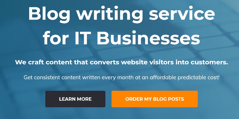
A good example of this is from our sister site, Tech Blog Builder. They use two side-by-side CTAs, highlighting the one they want people to take to make it stand out, but also giving them another option.
Create Landing Pages for Different Customer Types
Just as all business clients aren’t the same, neither are all residential clients. There are different distinct customer types and each type will react to different pain points and value statements.
You can make your residential MSP marketing more effective by dividing it into 2-3 different residential customer types and creating a landing page and associated marketing content for each.
Some examples:
- Seniors concerned with identity theft and connecting with family
- Freelancers or professionals working from home concerned about downtime, security, and productivity
- Families with students using technology for online learning and gaming worried about device lifespan and viruses
Make Your MSP Landing Page Your Centerpiece
A great residential MSP landing page can be a centerpiece for all your other marketing content. You can use it as a base to create social posts, videos, blogs, and more!
Do you have a great residential MSP landing page? Share the link in the comments!

Speak Your Mind